Natural Mineral Pigments: Colour and Materials in Traditional Painting

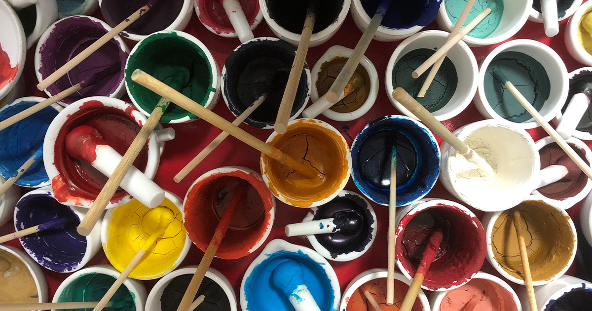
The same colour can look subtly different depending on its material and place of origin. Some pigments appear delicate and soft, while others are vivid and substantial. Some have a quiet appearance, while others reveal a distinctive texture or subtle lustre under the light. These differences do not come from brushwork alone. They are also shaped by the properties of the pigments themselves.
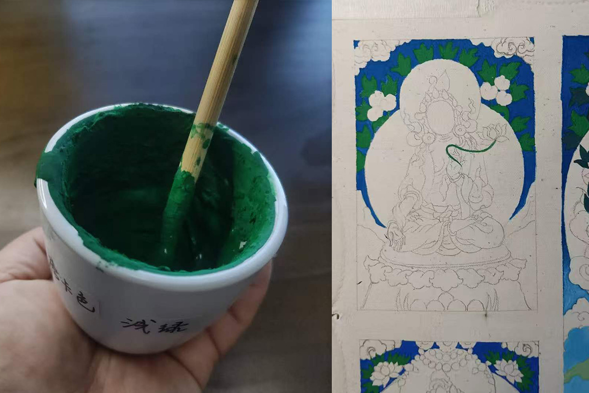
This reminds me of something a teacher once told us during a class. He had prepared a colour by hand and distributed it among his students. In theory, we were all using the same colour. Yet when we used it in our paintings, the results still felt different.
My teacher could not explain the difference with one simple answer. He reminded us that everyone handles a brush differently, with variations in pressure, speed, and movement.
If I were to offer a rather innocent explanation of my own, I would say that each person leaves a different trace when they work with a material. Perhaps this is part of what makes painting so interesting: even when the materials are the same, the results do not have to be identical.
Natural mineral pigments are important materials in both traditional Thangka painting and Chinese painting. They contribute not only colour, but also distinctive textures and ways of expression. The beauty of traditional painting comes from its imagery and techniques, as well as the artist’s understanding, selection, and use of materials.
Where Do Traditional Painting Colours Come From?
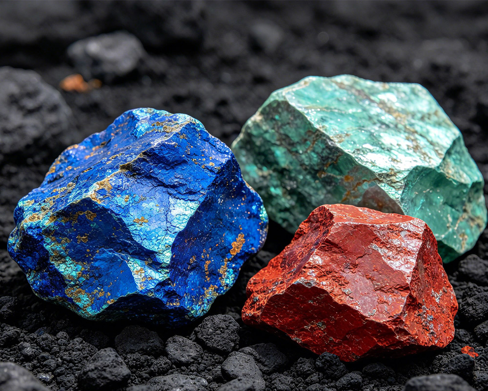
Natural mineral pigments originate from minerals found in nature. The raw materials must be selected, ground, and sorted before they can be used in painting. Different minerals have different colours and physical properties. Even pigments derived from the same mineral may vary according to their source, composition, and particle size.
Making a mineral pigment is therefore more involved than simply grinding a coloured stone into powder. Processing methods, preparation, and the way a pigment is adapted to a particular painting technique all require knowledge and experience.
With the development of modern materials, traditional painting is no longer limited to pigments made directly from natural minerals. In Japanese painting, for example, artists use natural mineral pigments as well as shin-iwa-enogu, a type of mineral-style pigment made from artificially produced coloured material. Other prepared pigments, including suihi-enogu, have their own manufacturing processes and characteristics. These materials broaden the range of colours available to artists and offer different textures and ways of working. They should not all be classified as natural mineral pigments, because their compositions and production methods differ.
Whether a pigment comes from a natural mineral or is made through a modern process, the artist needs to understand its properties in order to use it effectively.
What Pigments Are Used in Thangka and Chinese Painting?
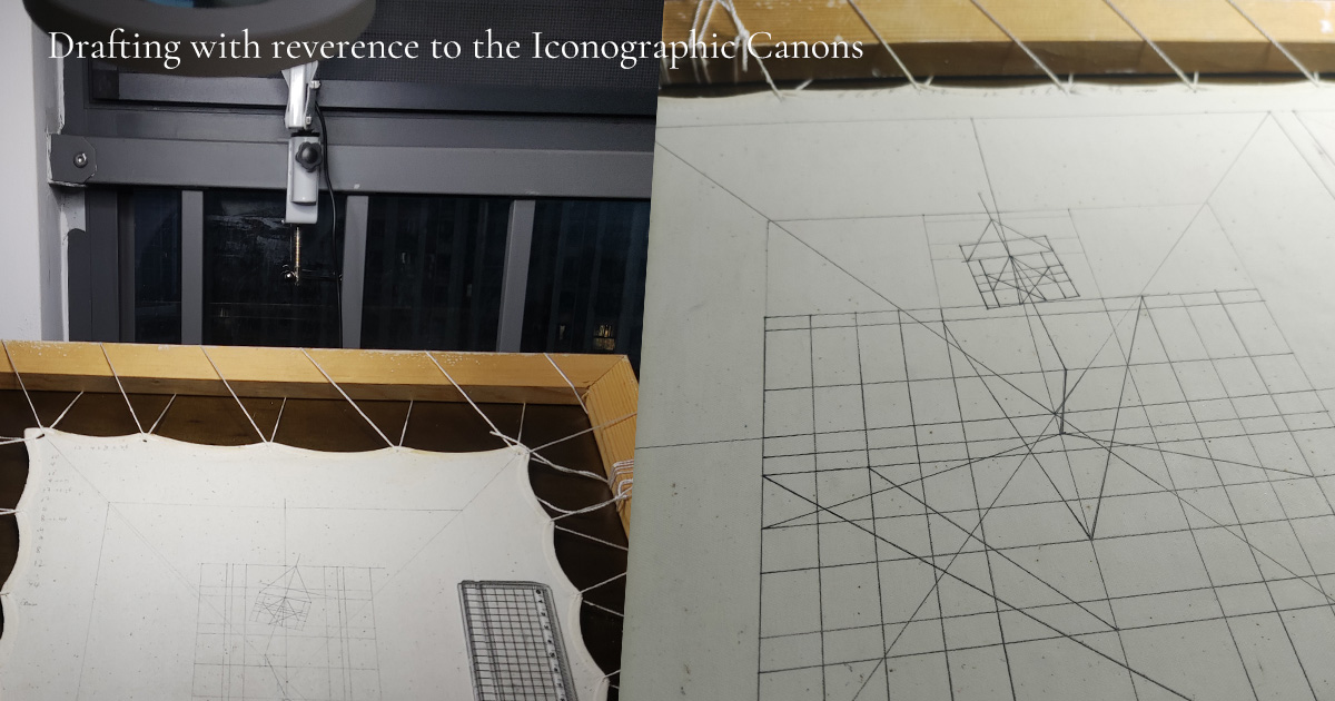
In the traditional painting practices I have encountered and studied, the origins and varieties of pigments are an important part of the learning process.
Some pigments used in traditional Thangka painting come from minerals found in Tibetan regions, while others have been sourced from elsewhere. The materials must be selected, ground, and processed before they become suitable for painting. Some mineral pigments require dry grinding, wet grinding, settling, and sorting by particle size. Depending on the material and the process, preparing a usable pigment can take considerable time.
Traditional painting also uses colours derived from plants and other organic sources. Indigo-based blues and traditional reds such as yan zhi (胭脂), for example, belong to a wider history of organic colourants. Their precise sources and formulations can vary across periods and methods of production.
In traditional Chinese painting, colours are often described using the terms shui se (水色, “water colours”) and shi se (石色, “stone colours”). In general, water colours tend to be more transparent and suitable for washes, while stone colours often refer to mineral-based pigments with stronger covering power. This is a practical traditional classification, however, rather than a rule that describes every pigment in every situation.
The familiar Chinese painting colours shi qing (石青) and shi lü (石绿) are commonly associated with azurite and malachite, respectively. Cinnabar is a red mineral pigment whose principal component is mercury sulfide. Traditional painting has also used white pigments made from shells, including clam-shell powder. Each material has its own characteristics and requires an appropriate way of handling it.
Behind the names of these pigments lies more than a system for classifying colours. They also reflect generations of observation and practical knowledge about natural materials.
I have often found it fascinating that artists from different regions and cultural traditions developed their own visual languages, yet sometimes arrived at similar choices of materials and techniques. Animal glue, for example, has been used as a binding medium in a number of traditional painting practices. The recipes and preparation methods are not identical, but these similarities invite us to explore the connections between different artistic traditions.
Today, geographical distance is less of a barrier than it once was. Materials, knowledge, and techniques can be shared more easily. Tradition is not necessarily a closed system that remains unchanged; it can continue to develop through study, practice, and exchange.
For an artist, understanding pigments means more than knowing their colours. It means learning what each material can contribute to a painting. That understanding is part of artistic experience.
Colour Is More Than Colour
When we look at a painting, we usually notice its overall palette first. Is the red vivid? Does the blue feel calm? Does the gold stand out? In the actual process of painting, however, colour is much more than a visual label.
The texture of a pigment, its covering power, and the way its surface reflects light can all influence the final appearance. Artists must decide where a particular pigment belongs, how it should be applied, and how it will interact with the colours around it.
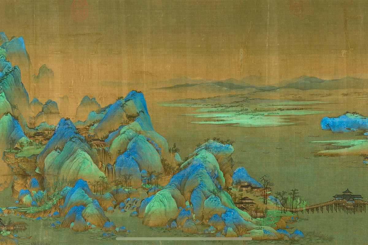
Take touqing (头青), a coarse grade of azurite pigment used in Chinese painting, as an example. Azurite can be ground and sorted into different particle sizes, producing different visual effects. Coarser particles can create a rich blue with a distinctive granular texture and a subtle sparkle under suitable lighting.
For this reason, touqing needs to be used thoughtfully. Too little may not allow its distinctive character to emerge; too much may overpower other parts of the composition. It is also an expensive material, so whenever I use it, I consider carefully where it will make the greatest contribution to the painting.
This is an important aspect of traditional painting: colour does not exist in isolation. It works together with line, composition, the painting surface, and other pigments to create the final image.
When I was a student, my teacher often reminded us to give colours room to speak.
I still remember that advice. Sometimes I feel that my line drawing looks beautiful on its own, but once I add colour, the painting seems less effective. Looking back, perhaps the problem is not the colour itself. Perhaps I have not yet found the right relationship between colour and line, or allowed each element to play its proper role.
More colour does not automatically make a painting better, and stronger effects are not always more effective. An artist must know when to intensify a colour, when to hold back, and when to leave space. A painting develops its own rhythm when colour and line work in harmony.
How Are Colours Used in Traditional Thangka Painting?
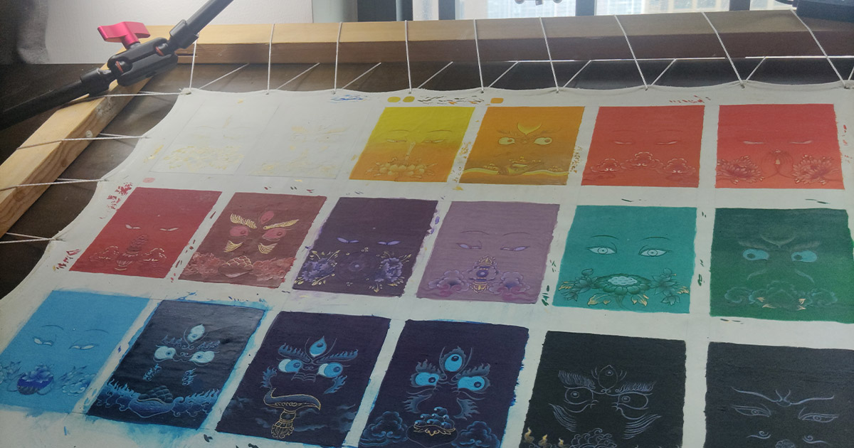
In traditional Thangka painting, colours are generally organised according to a considered visual structure. Contrast, balance, and gradation relate not only to the overall composition but also to the conventions of the imagery. Artists must consider both the effect of an individual colour and its place within the whole painting.
Colouring is therefore not simply a matter of filling in a completed drawing. It requires judgement and experience. And experience does not come only from personal experimentation; part of it is passed down by earlier generations of artists.
In the study of Thangka painting, experienced masters sometimes use plainspoken sayings and memorable, almost rhythmic phrases to help younger artists remember the characteristics of colours and the visual effects they may create when combined.
I once heard a traditional saying about colour relationships. As I remember it, the general meaning was:
“Blue and black are the fathers of colour: wherever they are applied, they lend dignity and brightness. Green is the uncle; whichever colour it meets, it benefits what came before. White is the mother of colours, from whom mixed colours are born. Ink-black is the steward, making wherever it is applied appear glossy. Red is a thief, stealing the beauty of neighbouring colours. Purple is a military officer; when used too heavily, it suppresses red…”
The wording and interpretation of such sayings may differ between teachers, lineages, and contexts. What I have recorded here is the general meaning as I remember it, rather than a fixed rule that applies to all Thangka painting.
These sayings are not scientific definitions of colour. They are vivid summaries of observations accumulated through years of painting. Their language makes them easier to remember, while reminding students that colours influence one another when they are placed side by side.
For beginners, such guidance can provide a useful starting point. But learning how to apply it still requires observation, practice, and adjustment.
Traditional knowledge is often passed down in this way. Some of it is written in books, some is embedded in materials and techniques, and some survives in a teacher’s explanations, demonstrations, and seemingly simple pieces of practical advice.
The Relationship Between the Artist and the Material
Learning traditional painting involves more than practising brushwork. It also means gradually becoming familiar with the materials.
This understanding cannot be gained entirely from reading. Books can explain the origins and names of pigments, but they cannot replace the experience of handling them and observing their texture, covering power, and changes in colour. Even with the same pigment, the amount of binding medium, the condition of the particles, the painting surface, and the way the brush is handled can all affect the result.
Sometimes, the difference lies in a detail that seems insignificant. A little more or less binding medium can change how the pigment adheres to the surface and how it looks when dry. Materials do not always behave exactly as we expect, which is one reason painting requires repeated testing and adjustment.
At the beginning, we learn how to handle and care for our pigments. Gradually, as we become familiar with their characteristics and understand how they respond under different conditions, we can begin to make them work more effectively for our artistic intentions.
Of course, this process also involves waste. Experimenting, adjusting, and repainting are all part of learning. Often, we only discover how to handle a material better next time by working with it ourselves.
After all, most human skills develop through repetition and sustained practice. Knowledge of painting materials is no different: it comes not only from reading, but also from experience accumulated through countless acts of making.
Mineral Pigments and the Visual Language of Traditional Thangka
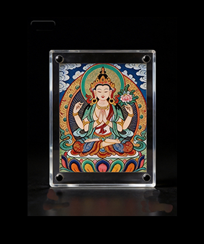
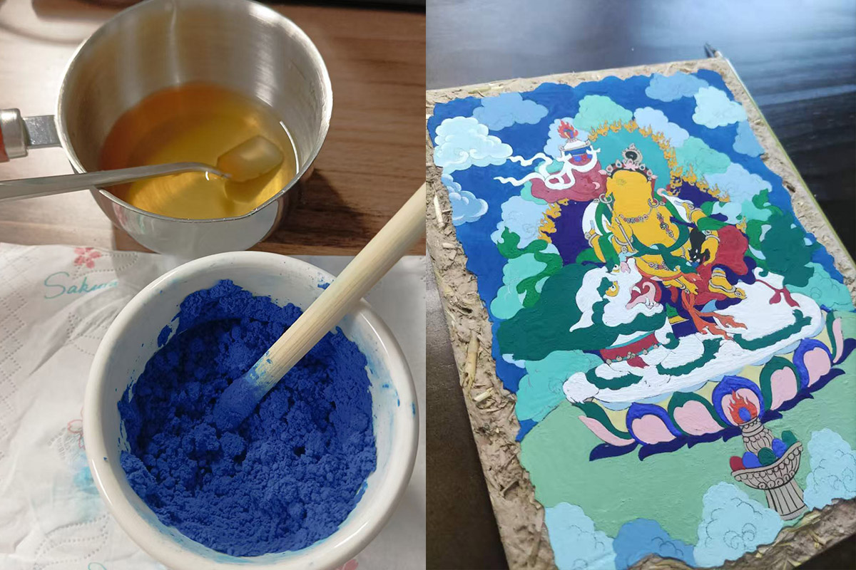
Traditional Thangka painting is often associated with vivid colours, intricate lines, and the use of gold. Yet these visual qualities are not determined by any single material.
The overall effect of a Thangka emerges from the interaction of many elements: the composition of the image, the organisation of lines, the relationships between colours, the properties of the materials, and the distinctive methods used to apply colour. Mineral pigments are an important part of this process, but they cannot replace the artist’s judgement and labour.
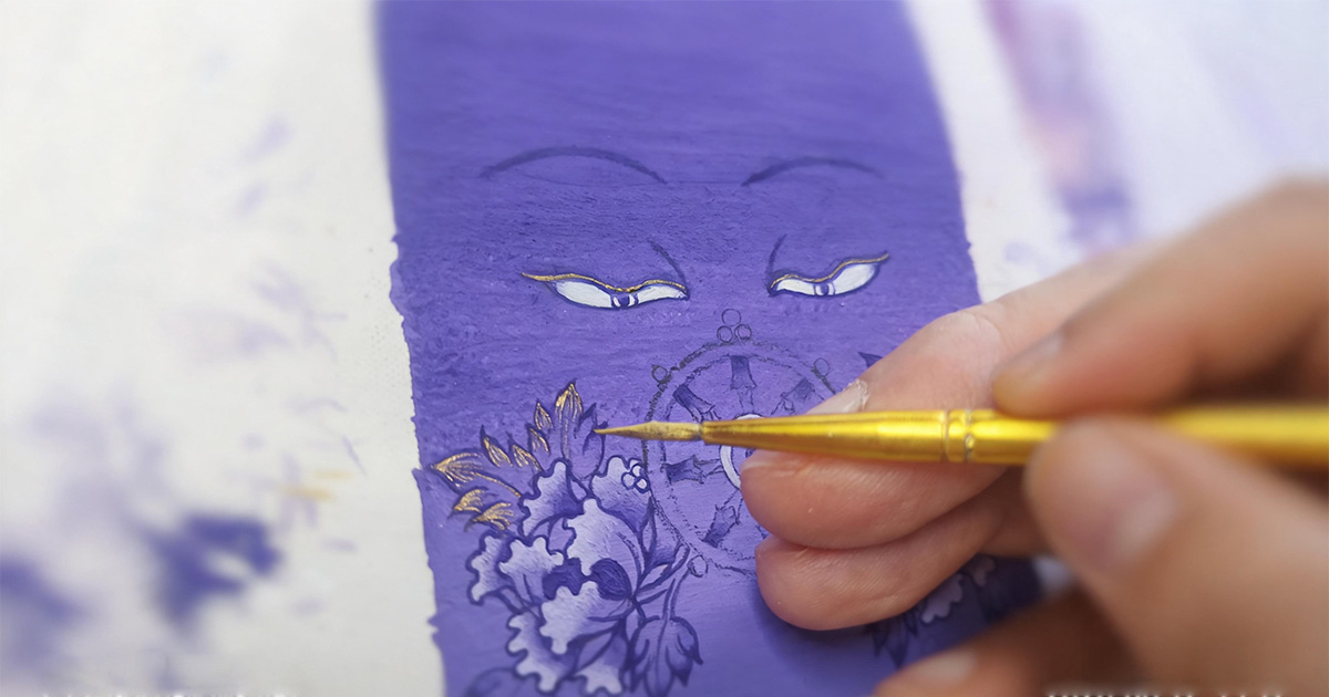
In a painting rich in detail, colours must work with the overall structure. They need to create clear layers while remaining connected to the lines and surrounding colours. Gold must also be used with care. It can emphasise the structure of forms, bring attention to details, and create a more distinct visual rhythm.
In religious art, gold also carries specific cultural and symbolic meanings. Its role is not simply to make a painting look more ornate; it is connected to the imagery, artistic conventions, and cultural context of the work.
The colours of a traditional Thangka are therefore more than decoration. They are part of the painting’s structure and one of the ways its visual language is expressed. As in other painting traditions around the world, colour can establish atmosphere, create visual hierarchy, and shape how viewers experience a work.
Understanding pigments helps us look more deeply at these paintings. We see not only the colours on the surface, but also the traces of materials, techniques, and accumulated practice.
Looking at a Painting Through Its Materials
Today, we can view many traditional paintings through reproductions, screens, and digital images. Images are easier to access than ever, but different forms of reproduction can change how we experience an original work.
Ultimately, some experiences can only be fully appreciated in front of the original. Museums and original artworks matter because they offer a way of looking that screens and printed reproductions cannot completely replace.
The colours on a screen are produced by a display, while printed images are influenced by paper, ink, and printing processes. These formats can communicate a painting’s composition and colour relationships, but they may not fully convey the texture of its materials, the variations on its surface, or its finer details.
When we begin to pay attention to painting materials, the way we look at an artwork changes. We no longer ask only which colours were used. We also notice how they cover the surface, how they interact with the lines, and what kinds of texture they create.
When I first entered the Central Academy of Fine Arts, I attended a copying class in which our teacher took us to the materials room to collect reproductions of paintings for study. My first reaction was: Why did all these images look so grey, dull, and old? Some areas were so unclear that I could hardly make out the details. Faced with these reproductions, I did not know where to begin.
After studying for some time, I gradually became accustomed to the appearance of these printed images and learned how to observe line, composition, and colour relationships through the limited information they provided.
Later, however, when I had the opportunity to visit museums in Beijing and stand in front of original paintings, the experience was completely different.
The paper, mounting, and subtle variations in ink that could not be fully reproduced in a printed image made me realise how many layers an original work can hold. Mineral pigments may retain aspects of their colour and texture over long periods, although their actual condition depends on the pigments themselves and the environment in which the artwork has been preserved.
That experience is difficult to communicate through a reproduction. You may not be able to explain exactly what makes it different, yet you become aware that the painting before you is more than an image. It is a physical presence shaped by materials, craftsmanship, and time.
These experiences have made me increasingly aware that original artworks and museums cannot simply be replaced. Digital images allow us to encounter art more easily, but they do not necessarily reproduce the experience of standing in front of an original.
Conclusion: Colour Comes from Both Material and Experience
For me, studying traditional Chinese painting and Thangka is not only about learning how to make a painting. It is also about gradually understanding why traditional art developed in the ways it did.
Brushwork, pigments, painting surfaces, and individual stages of the process may appear separate, but they are closely connected. The colours in a finished painting come from the artist’s choices as well as the properties of the materials themselves. It is through their interaction that colour becomes part of the image.
Understanding materials is one way of understanding traditional painting. When we know where colours come from and how they are used, a painting becomes more than a visual result. It reveals something about technique, experience, and the traditions that shaped it.
Materials and techniques continue to evolve with the times. Keeping a tradition alive does not mean leaving everything unchanged in the past. It means understanding what has been handed down, continuing to learn and practise, and finding new ways to express it.
Golden Ink Arts is an independent contemporary art practice by artist Niohe. Drawing inspiration from Chinese calligraphy, Chinese painting, Thangka, and related Eastern visual traditions, it explores how traditional artistic languages can find new expression in modern life.
Quiet Eastern Art for Modern Living.
Frequently Asked Questions
What are natural mineral pigments?
Natural mineral pigments are colouring materials made from naturally occurring minerals. They are processed into fine particles for use in painting. Their colour, particle size, texture, and covering power can influence the appearance of an artwork.
What is the difference between mineral pigments and plant-based colours in traditional Chinese painting?
In traditional Chinese painting, mineral-based colours are often called shi se (stone colours), while certain more transparent colours are known as shui se (water colours). Mineral pigments often provide stronger coverage and a granular texture, while many plant-derived colours are more transparent and suitable for washes. The actual properties depend on the specific pigment and how it is prepared.
Why do original traditional paintings look different from printed reproductions?
Original paintings preserve the physical qualities of their materials, including surface texture, brushwork, pigment particles, and subtle variations in colour. Printed reproductions and digital images are affected by the printing process, paper, or display settings, so they cannot always convey these qualities fully.